My Tiny Easter Project on Hong Kong's COVID-19 Clusters
I obtained the publicly available crowdsourced data behind the famous open-sourced COVID-19 information site in Hong Kong, wars.vote4.hk, and started some cleaning on the data.
For each confirmed case, a brief summary (unfortunately in plain text) of the patient, for example, where did the patient go, is available. The summary could also include the case numbers of the persons that the patient was in contact with. Such transparency on the data might not have been available for some of the places in the world that are suffering from the disease, given the huge number of cases in those areas and the lack of records.
And then I started writing a tiny Python script, with the help of some simple tricks including regular expressions to build the graph data from the raw confirmed case records. Cases that are interrelated are grouped together into clusters, and I subsequently added labels by associating the larger clusters into the named ones that were mentioned on the news. The data parsing work was not as easy as I think, because the data format was not that consistent. This made me recall an observation that my supervisor has made:
Data engineering usually takes more time than data analysis itself.
# Match all the "Bars and Bands" cases, while catering different types of variations
r'bars? (?:and|\&) bands'

# Catching Chinese phrases containing the case numbers
r'第(?:[ 、及\d]+)宗'
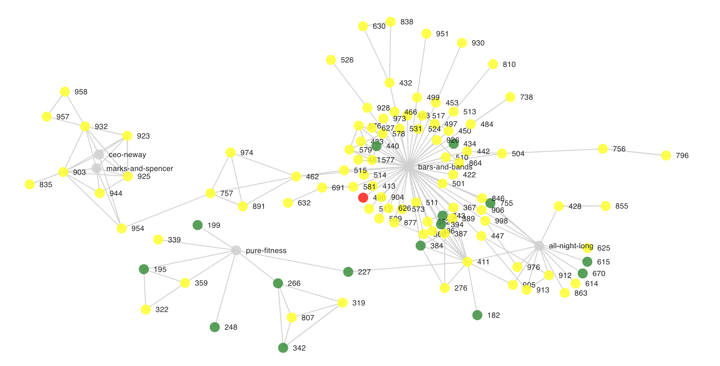
Once the cluster dataset was ready, I started building a small webpage on React with the help of Material UI and react-d3-graph. In fact, that didn’t take as much time as data cleaning. Note I didn’t set up an API for fetching the data since all in all, it required some (a bit heavy) offline pre-processing. The page includes the cluster chart itself, together with a simple dropdown field to let myself filter for a named cluster or to search for a cluster containing a particular case.
While I would not describe my work as really insightful or useful, there were indeed some findings that I wouldn’t have realized in case I only looked at the original data in its tabular form. For example, I didn’t know that the clusters “CEO Neway” / “Marks & Spencer” were in fact linked to the “Bars and Bands” cluster in Lan Kwai Fong:
In fact, the whole exercise didn’t require very advanced techniques in both data analytics and frontend, but it is already good enough to let us have a quick look at the interrelationships between the cases. But more importantly, I feel that I have made good use of my Easter holiday to do something I love!
Lastly, if you are interested, you may find the published site here, with the automated deployment and update of data every 24 hours: covid19.gabrielkoo.com
The original post was first published on Linkedin.